
Room Decor Ideas
Bedroom color ideas: calm palettes and how to test them
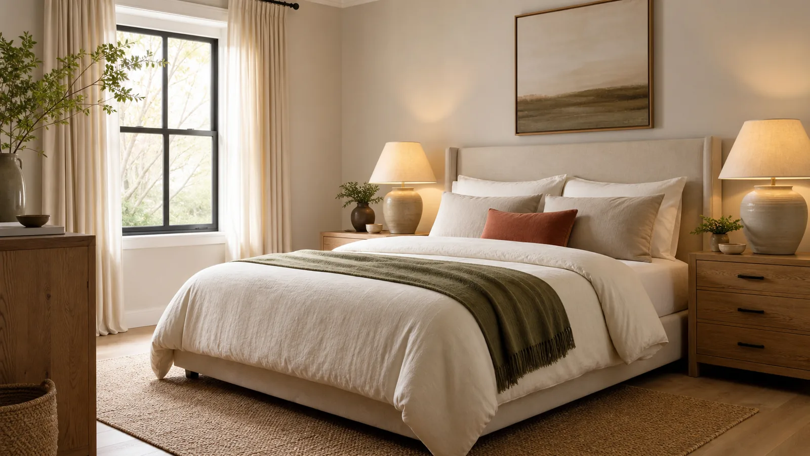
A bedroom is seen in two very different lights: daylight when you get dressed and lamplight when you wind down at night. The best bedroom color ideas work in both, which is why a calm bedroom palette is chosen and tested differently from a living room or kitchen.
Color is one step in the full bedroom plan, after the bed wall, clearances and lighting, as laid out in the bedroom ideas plan. The steps here stay with the bedroom itself: choosing one main color, building a palette around it and testing it before you paint.
What color should a bedroom be?
Start with how the room needs to work. A bedroom used mainly for sleep and dressing needs a color that stays easy on the eyes at night and still reads true in the morning. Most of the time that means a soft main color with low contrast between the walls, the bedding and the curtains.
The room's light changes the choice. The same paint looks different in morning daylight, in afternoon sun and under lamps at night. Note how much daylight the room gets, since that changes how every sample reads. In a bedroom the evening matters more than in other rooms, since warm 2700K lamps make most colors look warmer.
Pick one main color first and let it cover the largest surface, usually the walls. Everything else in the palette is chosen to sit next to it.
Calming bedroom colors that work in most homes
There is no single most calming color, and no paint color will fix a room that is crowded or brightly lit at night. Still, a few families of color come up again and again in calm bedrooms.
Warm whites and creams keep a room light without feeling stark. They need at least one deeper color nearby, such as a wood nightstand or a darker throw, or the room can look flat. Soft warm neutrals such as sand, taupe and greige sit well with wood floors and white bedding. Muted greens and soft blues bring a little color while staying quiet, especially when they lean gray or earthy rather than bright.
Designers also use deeper colors in bedrooms for a cocooning feel. A dark color on the wall behind the bed, or across the whole room, can feel restful when the room is lit by low lamps in the evening. It suits rooms used mostly at night and needs good daylight or a light ceiling to avoid feeling closed in.
Bedroom color ideas with real paint examples
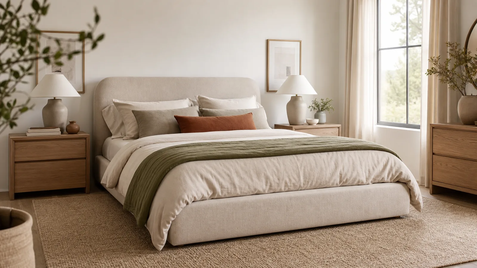
Names help when you stand in front of a paint display, so here are three warm neutrals that show the range. They are examples to sample, not the only right answers.
Sherwin-Williams Universal Khaki (SW 6150) is a sand color that sits between beige and taupe. It works as a main wall color with white bedding and mid-tone wood. Dutch Boy Melodious Ivory (313-2DB) is a soft, creamy beige, a softer choice than bright white. Benjamin Moore Silhouette (AF-655) is a deep espresso brown with charcoal notes. Used on a bed wall or in a room you mostly use at night, it gives the cocooning effect without the coldness of black.
Paint colors can look different from brand to brand and from chip to wall, so treat any name as a starting point. Every one of them still goes through the test described below.
Good bedroom color schemes with the 60-30-10 split
A simple split keeps a palette calm. Use about 60 percent main color, 30 percent secondary color and 10 percent accent. In a bedroom, the walls usually take the 60 percent. The bedding, curtains and rug make up the 30 percent, and small pieces such as pillows, a throw, lamp bases or art carry the 10 percent.
A few schemes that follow the split:
- Sand walls, white bedding and linen curtains, with walnut and black accents.
- Warm white walls, a soft green duvet and an oatmeal rug, with brass accents.
- Soft blue-gray walls, cream bedding and a gray-beige rug, with warm wood accents.
- Deep brown bed wall, cream walls elsewhere and white bedding, with caramel accents.
Keep the number of accent colors to one or two. A calm bedroom rarely needs more.
Bedroom color ideas for dark wood furniture
Dark wood furniture is heavy visually, so the walls should give it some contrast. Warm whites, creams and light sand colors let a dark dresser or bed frame stand out without the room feeling dark. Very deep walls next to dark wood can make the furniture disappear in the evening.
Watch the undertones. Wood with a red or orange cast usually sits better next to warm neutrals than next to cool grays. Test any color right next to the furniture, not on a wall across the room.
How to test paint colors in a bedroom
Never choose a bedroom color from a chip. Buy sample pots of a short list of favorites and paint large samples on at least two walls, or paint large boards that you can move around the room. Judge the chips themselves by a window in natural light, not under store lighting.
Look at the samples in the morning, the afternoon and the evening. In a bedroom, the evening check matters most: turn on the bedside lamps you actually use and see how the color looks by their light. If those lamps still have cool bulbs, switch them to warm bulbs first, as bedroom lighting ideas explains, or the test will mislead you. Check each sample next to the floor, the bedding and the curtains you plan to keep.
If a color you love feels a little strong on the wall, try the shade one or two steps lighter on the same strip. Paler shades are also easier to pair with bedding and furniture you already own.
Leave the samples up for at least a day or two, so you see them in changing light before you decide.
Let the floor, curtains and bedding join the palette
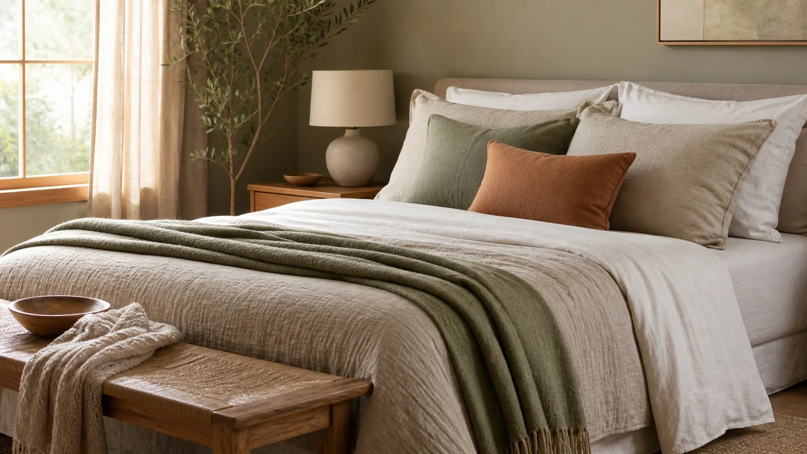
Paint is only part of the color in a bedroom. The floor, the rug, the curtains and the bed cover large areas, so they belong in the 30 percent. Choose them to sit near the wall color rather than against it.
Treat the floor and any built-in wood as fixed points, and choose paint that works with them. A wood floor counts as a color. Honey oak, pale ash and dark walnut each pull the palette in a different direction, so test paint next to the floor first. Curtains that are close to the wall color make a window look calmer, while curtains a shade darker frame it. The duvet is the easiest place to change the mood later, since it costs far less than repainting.
The order of steps and common mistakes
Work through the color decisions in this order:
- Note which way the windows face and when the room is used most.
- Choose one main color family.
- Pick a short list of paint samples in that family.
- Test them on two walls, morning to evening, next to the floor and bedding.
- Choose the secondary colors for bedding, curtains and rug.
- Add one or two accent colors last.
The common mistakes are choosing from a chip under store lighting, testing only in daylight and adding a new accent color with every purchase. Once the walls are painted, live with the room for a week before you buy more. Change the duvet or pillows before you change the walls.
Frequently asked questions
What is the most calming color for a bedroom?
There is no single answer. Warm whites, soft warm neutrals, muted greens and soft blues are common calm choices, and low contrast between walls and bedding matters as much as the color itself.
Can you paint a bedroom a dark color?
Yes. Deep colors can feel restful in a room used mostly at night. Test the sample under your evening lamps, and keep the ceiling or bedding light so the room does not feel closed in.
How many paint samples should I test?
A small shortlist in the same color family is usually enough. Paint them large on at least two walls and look at them in the morning, afternoon and evening.
What colors go with white bedding?
Almost any calm wall color. Sand, warm white, soft green and blue-gray all work, and white bedding is the easiest secondary color to keep in a calm palette.
Related guides
Room Decor Ideas
Bedroom ideas: a step-by-step plan for a calm, working bedroom
Bedroom ideas planned in order: where the bed goes, clearances by bed size, lighting, color, storage, rug size and a room set up for better sleep.
Room Decor Ideas
Functional home decor: a room-by-room plan for a home that works
Functional home decor in a clear order: daily routes, zones, storage at the point of use, lighting you control, and smart home decor ideas that hide the tech.
Room Decor Ideas
Bedroom storage ideas: closet, dresser and under-bed storage that stay tidy
Bedroom storage ideas in order: closet first, then the dresser and under-bed storage, with closet clearances, lidded boxes and safe dresser anchoring.