
Styles
How to mix wood tones in one room
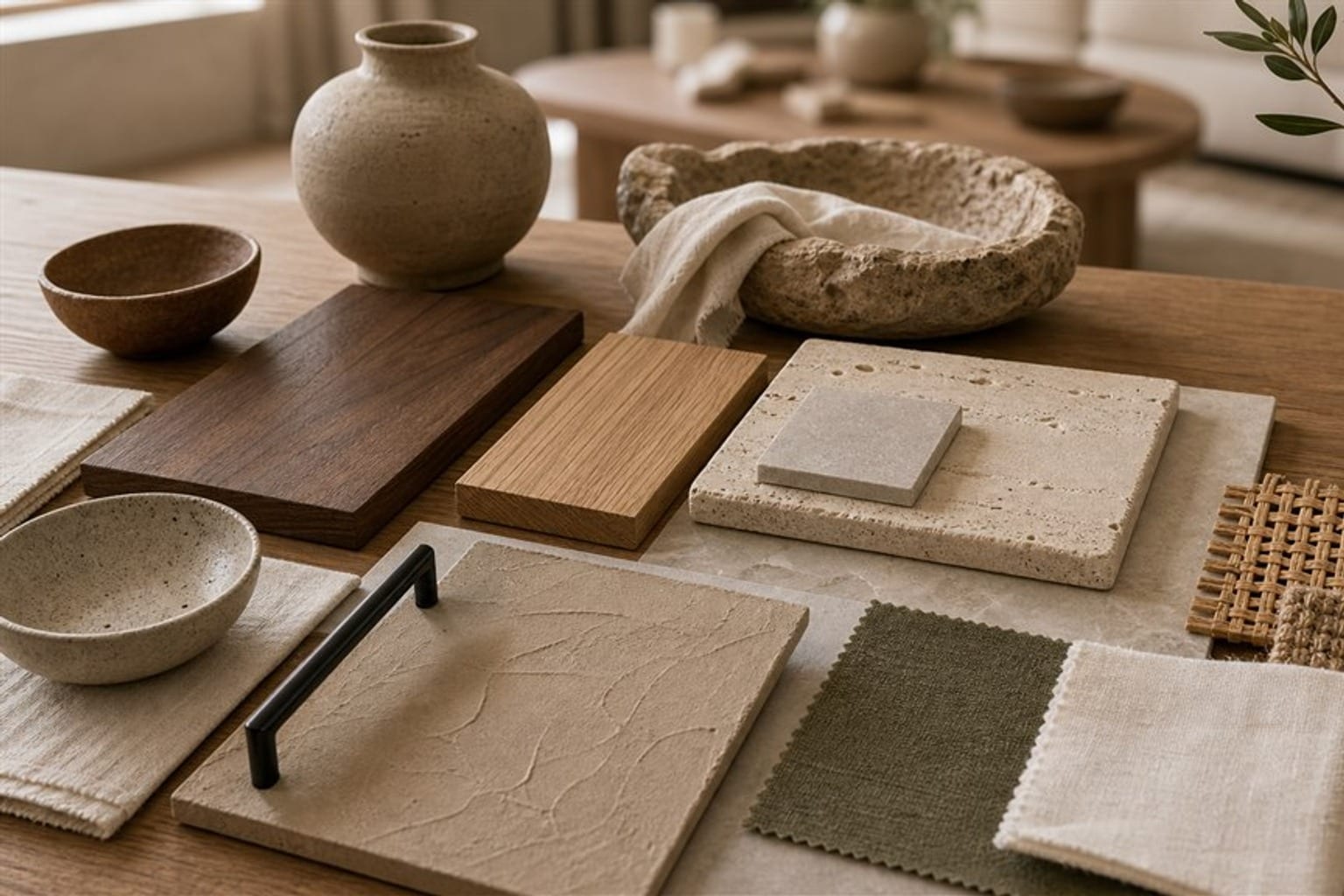
Knowing how to mix wood tones is less about matching and more about choosing on purpose. Very few homes have one wood. Most rooms hold several: the floor, a table from a parent, a new bookcase and a dresser found at a yard sale. When those woods look planned, a room feels collected and warm. When they look accidental, it feels a little off, even if every piece is nice on its own.
A planned mix usually comes down to three things. One wood leads, the others clearly differ from it, and each wood appears more than once. A few plain terms help with every later step, and a short recipe at the end works in any room.
What a wood tone is: color, undertone, and grain
Four terms do most of the work.
- Tone: how light or dark the wood looks, from pale ash to deep walnut.
- Undertone: the color beneath the surface color. Warm woods lean yellow, orange, or red, like cherry, red oak, and many honey finishes. Cool woods lean gray, like weathered or gray-washed oak. Neutral woods sit between, and walnut is the classic example.
- Grain: the pattern of the wood. Oak has an open, visible grain; maple and birch are smooth and quiet; walnut often has soft, wavy figure.
- Finish: the sheen on top, from matte oil to glossy lacquer. Two woods of the same tone can look different just because one is shiny.
To find an undertone, put the pieces side by side near a window in daylight. Compare each with a sheet of white paper. The color that shows at the edges of the paper is the undertone.
Check again in the evening. Warm bulbs push every wood toward orange, and older finishes yellow with age, so a pairing that looks balanced at noon can look too close, or even clash, at night. If you are buying online, ask for a photo in daylight or order a finish sample before the full piece.
How to mix wood tones: start with the largest wood
The largest wood in a room sets the base. In most homes it is the floor. In a kitchen it may be the cabinets; in a bedroom, a large bed frame or wardrobe.
Everything else relates to that base. Ask one question of each new piece: does it clearly match the base, or clearly differ from it? Both answers can work. The trouble comes from the middle, a wood that is almost the same as the floor but not quite.
Older homes in the Carolinas often show this well: warm heart pine floors next to newer oak furniture. The mix works when the furniture is either much lighter or much darker than the floor, not a near copy of it.
The 60-30-10 idea applied to wood
Designers often split color in a room roughly 60, 30 and 10 percent, and the same idea helps with wood. About 60 percent of the wood you see is the main wood, often the floor or the largest furniture. About 30 percent is a second wood that contrasts with it, such as a darker coffee table and shelving on a pale floor. The last 10 percent is an accent wood in small pieces: a picture frame, a bowl or a stool.
In a real living room, it might look like this. A medium oak floor is the 60 percent. A walnut coffee table, a walnut media console, and a walnut bookcase make the 30 percent. A pale ash stool and two light wood frames are the 10 percent. Each wood has a clear role, so the room reads as one plan instead of three separate purchases.
Three woods is a comfortable limit for most rooms. More can work in a very collected, vintage-heavy room, but each extra wood makes the mix harder to read.
Contrast or match: why near-matches look like mistakes
Near-matches are the most common problem. A walnut-stained side table beside a slightly redder cherry cabinet looks like a failed attempt to match. The eye reads it as an error.
Clear contrast reads as a choice. Pale oak with deep walnut works, and so do honey pine with black-stained ash or whitewashed wood beside a warm brown chair. The difference is obvious, so it looks intended.
Once a tone is in the room, repeat it at least once more. A single dark chair on a pale floor can feel stranded. Add a dark frame, a dark bowl, or a dark lamp base on the other side of the room, and the chair suddenly belongs. Keep the base, change the details.
Buffers between woods: rugs, paint, and textiles
When two woods touch, the contrast is strongest, and a buffer softens it. A rug between a wood floor and a wood coffee table separates the two surfaces and gives the eye a rest. A painted piece, such as a white or black side table, breaks up a room with a lot of brown.
Textiles help too. Linen, wool and cotton in the room's colors connect the woods without competing with them. And a black metal lamp or a stone tray adds a material that is not wood at all.
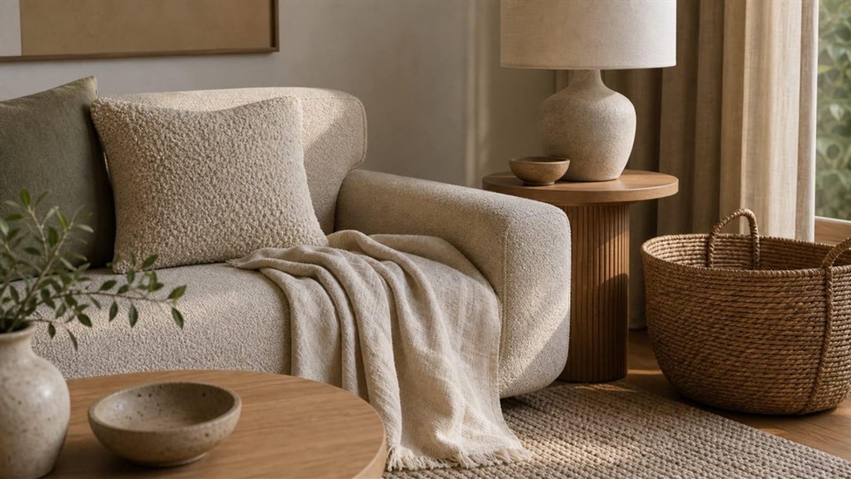
Mixing wood tones in the living room, dining room, bedroom, and kitchen
Each room has a different largest wood, so the recipe shifts a little.
- In the living room, the floor leads. Contrast it with the coffee table and shelving, then repeat that second wood in frames or a stool. A rug between floor and table is the most useful buffer.
- In the dining room, the table is the star. Chairs can match it for a calm set or contrast for a collected look, such as a walnut table with pale oak chairs. Repeat the table's wood in a sideboard or frames. Mixed chairs work too, as long as they share one thing: the same finish, the same shape or the same seat fabric.
- In the bedroom, avoid a near-match between the bed and the nightstands. Either use a matching set on purpose, or choose clearly different nightstands and repeat their wood in a mirror frame or a lamp base.
- In the kitchen, when cabinets and floor are both wood, make them clearly different in tone and let the counter or backsplash act as the buffer between them.
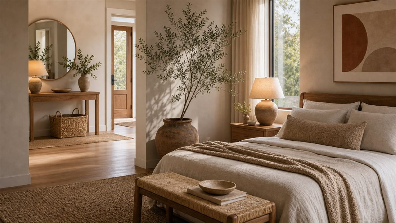
Mixing wood tones: oak and walnut, warm and cool
Some pairings work in almost any home. Oak and walnut is the most dependable: pale or natural oak as the main wood, walnut as the second, and the two look clearly different. Warm honey woods can also sit beside cool gray-washed woods, as long as one clearly leads and each appears at least twice.
Black is the easy partner. Black-painted or black-stained pieces act as a neutral, sit well with almost every wood and help tie a mixed room together. White trim and pale wood keep a room bright, though one darker wood stops it from feeling flat.
Borrow the idea, not the theme: these pairings work because of contrast and repetition, not because of any one style.
A quick wood-tone recipe
- Name the largest wood in the room and its undertone.
- Choose a second wood that clearly contrasts with it, lighter or darker.
- Add one accent wood in small pieces, if you want a third.
- Repeat every wood at least twice, in different places.
- Put a rug, a painted piece, or a textile between woods that touch.
- Check the room in daylight and at night, since lamplight warms every wood.
Wood is one of the materials that define most home decor styles for modern homes, from the pale oak of Scandinavian rooms to the darker, worn finishes of farmhouse spaces. Knowing your woods makes any style easier to build.
Frequently asked questions
Can you mix wood tones in a room?
Yes. Most rooms look better with more than one wood. Let one wood lead, make the others clearly different from it, and repeat each wood at least twice.
What wood tones complement each other?
Pale oak and walnut, honey pine and dark stained wood, and most woods beside black or white painted pieces. Pairings with a clear difference in tone look intentional.
Should wood furniture match the floor?
It does not have to. A clear contrast with the floor usually looks better than a near-match. If you want a match, make it exact, or add a rug in between. If you plan to replace the floor later, choose furniture that contrasts with it, so the furniture still works with the next floor.
Can black furniture work with mixed wood tones?
Yes. Black acts as a neutral and helps connect different woods. A black side table, frame, or lamp base can pull a mixed room together.
Related guides
Styles
Home decor styles for modern homes
Compare the best home decor styles for modern homes and learn how to choose a style direction that feels practical timeless and personal

Styles
Japandi style ideas: what defines the look and how to use it at home
What Japandi style is, the palette, wood tones and low shapes that define it, how it differs from Scandinavian, and a simple recipe for any room.

Styles
Modern tribal living room ideas with warm global style
Design a modern tribal living room with earthy colors natural materials handmade texture pattern and comfortable layout