
Home Decor Trends
Color trends for home decor choosing palettes that age well

Start with colors that can live longer than a trend
Short answer: the color directions worth keeping right now are warm neutrals and earthy, nature-based tones. They sit well with wood, stone, and linen, so they are less likely to date. Brighter trend colors are worth trying, but in pieces you can swap in an afternoon.
Before choosing any color, look at what the room already has. Flooring, cabinets, countertops, large furniture, and window light set a palette you are unlikely to change soon. A new color should join that palette, not fight it.
This guide covers the base, the nature-based tones, how to test trend colors cheaply, and which choices tend to date. For every color, ask how it will look in five years.
Use warm neutrals as the base
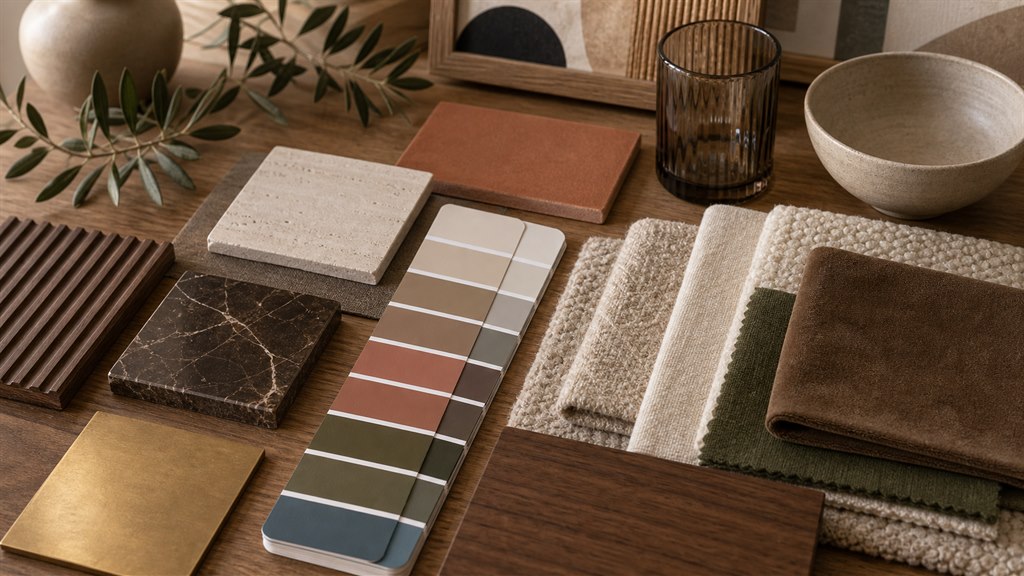
Warm neutrals are one of the safest ways to make a home feel current without making it feel temporary. Cream, ivory, oatmeal, beige, taupe, mushroom, and soft greige can carry many different decor styles. They work with modern furniture, natural materials, vintage accents, and simple everyday pieces.
The key is choosing a neutral with enough warmth. A flat white room can feel cold when the light changes. A warm neutral gives the room softness and makes wood, stone, linen, and ceramic feel more connected. It also gives you freedom to update smaller pieces later without repainting everything.
Use the base color on the largest areas first. Walls, sofas, curtains, rugs, and large cabinets need to feel calm because they control the mood of the room. Smaller accents can carry more personality once the main surfaces are settled.
Bring nature into the palette
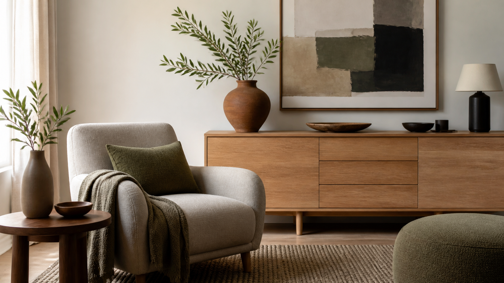
Nature-based colors usually age better than artificial colors because they feel familiar. Soft green, muted olive, warm brown, clay, terracotta, sand, stone, linen, and mineral blue can make a room feel grounded. These colors are easy to repeat through plants, wood, pottery, textiles, and artwork.
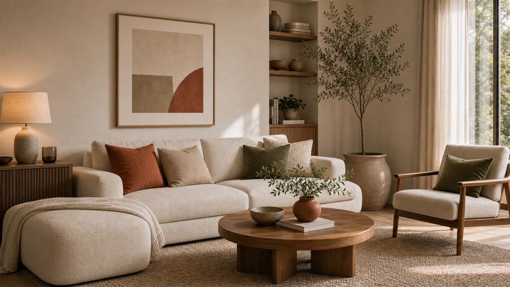
A natural palette does not mean the room has to look rustic. It can feel very modern when the lines are clean and the materials are controlled. A smooth stone table with olive cushions and cream walls can feel current. A simple sofa with clay pillows and a walnut table can feel warm and refined.
Natural colors are also forgiving. They change well in daylight and evening light. They make imperfect materials feel intentional. They let the room breathe instead of asking every object to perform.
Follow trends through small pieces first
Trends belong in the easy-to-change layer. Sort color decisions by what they cost to undo.
- Keep: warm whites, soft taupe, greige, and wood tones on walls, sofas, rugs, and cabinets. They carry most styles and make later changes cheaper.
- Try: olive, clay, terracotta, muted blue, and deep brown in pillows, throws, lampshades, prints, and vases. If a color still feels right after a few months, move it into a larger piece.
- Skip for now: a very saturated trend color on anything expensive or fixed, such as tile, cabinets, a sofa, or a full room of paint.
A good trend color also flatters what you already own. If it makes the sofa look dull or the floor look orange, it is the wrong direction for this room, however popular it is.
Connect color choices to the main style plan
Color decisions become easier when they support the full direction of the home. Use the home decor trends and interior design styles guide as the main reference, then let each palette support the style you want to build. A warm minimalist room needs softer restraint, while a neo deco room can accept deeper contrast and a quiet luxury room needs more controlled tones.
This keeps the color palette from becoming random. The trend is not used because it is popular. It is used because it helps the room express a clear style direction. Once the direction is clear, every color has a job. The wall color creates calm. The wood tone adds warmth. The accent color gives rhythm. The dark tone gives weight.
Use the 60-30-10 rule gently
The 60-30-10 rule gives a main color about 60 percent of what you see, a secondary color about 30 percent, and an accent about 10 percent. It is a quick check when a room feels scattered.
- Living room: warm white walls (60), a taupe sofa and rug (30), and olive pillows, plant pots, and a print (10).
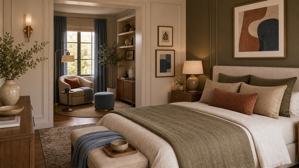
- Bedroom: cream walls and bedding (60), oak and natural linen (30), and clay or soft blue in a throw and a lamp (10).
- Home office: soft greige walls (60), a walnut desk and shelves (30), and deep green in a chair or book spines (10).
Treat the numbers as a guide. Wood tones and texture often count as the secondary layer, and a room can still feel balanced when the accent appears in only three or four places.
Create contrast with texture as well as color
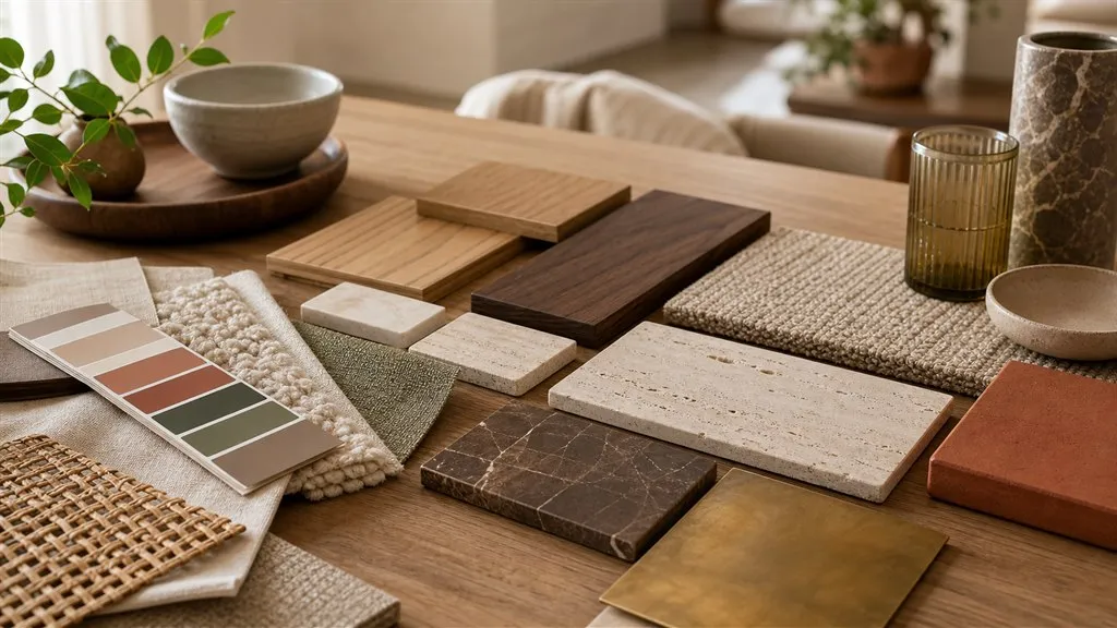
Contrast does not have to come only from dark and light colors. Texture can create depth in a quieter way. A cream room can feel rich when it has linen, wool, stone, wood, and ceramic in the same palette. A beige room can feel layered when the rug is nubby, the curtain is soft, and the table has visible grain.
This is important when you want a room to feel timeless. Strong color contrast can date quickly when it follows a very specific trend. Texture lasts longer because it comes from materials people already understand. A calm palette with strong texture can feel fresh for years.
Check every color in real light
Light changes color more than most people expect. A paint color can look soft in the morning and heavy at night. A fabric can look warm in a store and grey at home. A wood tone can become orange beside the wrong wall color. This is why testing matters before making a large choice.
Place samples near the floor, near the window, and beside the largest furniture. Look at them in morning light, afternoon light, and evening light. A color that works in all three moments is much safer than a color that only looks good once a day.
Choose room by room without losing the whole home
Each room can have its own feeling, but the full home should still feel connected. The living room can be warm and open. The bedroom can be softer. The entryway can be slightly deeper. The kitchen can be cleaner. The connection can come from repeated wood tones, repeated white tones, or one accent color that appears in small ways across the home.
This is especially useful in smaller homes. If every room uses a completely different color story, the home can feel broken into pieces. A connected palette makes the space feel larger and calmer. It also makes future decorating easier because new pieces can move from room to room without looking lost.
Avoid colors that only look good online
Some trend colors look beautiful in edited photos and difficult at home. Watch for three signals before committing.
- Very saturated shades in rooms with little daylight. They can make the room feel smaller and darker by late afternoon.
- Very pale colors in rooms with few textures. They can look washed out rather than calm.
- Very dark walls without enough lamps. Dark colors look elegant only when the lighting and furniture scale are strong enough to hold them.
Choose colors that match the actual room, not only the reference image. The best palette makes furniture look better, skin tones softer, and daily life calmer. If a color needs perfect styling to work, it may not suit a real home.
Edit the palette before adding more decor
When a room feels unfinished, many people add more objects, but the real issue is often the palette. Remove one color that feels disconnected before buying more decor. Repeat the strongest tones in small ways, and let the quiet colors hold the space together. A good palette makes simple furniture look better and makes fewer accessories feel enough.
Color trends are most useful when they help the home feel alive without making it feel temporary. The best choices are calm enough to last and fresh enough to feel current. Build the palette with light, materials, proportion, and daily comfort in mind, and the room will age with more grace.
Frequently asked questions
Which home decor colors are least likely to date?
Warm whites, soft taupe, greige, and colors tied to natural materials, such as wood browns, stone grays, and muted greens. They work with many furniture styles, so new pillows or art are enough to refresh them.
How can I try a trend color without repainting?
Start with pillow covers, a throw, a lampshade, a print, or a vase, and keep it for a few months. If you still like it, repeat it in a larger piece such as a chair or rug before committing to paint.
Should every room in the home use the same palette?
Not the same palette, but a connected one. Repeat one white, one wood tone, or one accent across rooms so the home reads as a whole while each room keeps its own mood.
Related guides

Decor Accents
How to choose accent pieces for a neutral living room
A practical guide to choosing accent pieces for a neutral living room with calm color balanced texture useful scale and a clean modern look
Home Decor Trends
Interior design styles and home decor trends for 2026
Explore 2026 home decor trends interior design styles colors materials and timeless choices for a stylish modern home
Home Decor Trends
Modern home decor ideas for 2026
Explore modern home decor ideas for 2026 with warm neutrals natural texture layered lighting storage and decor accents for calm rooms